
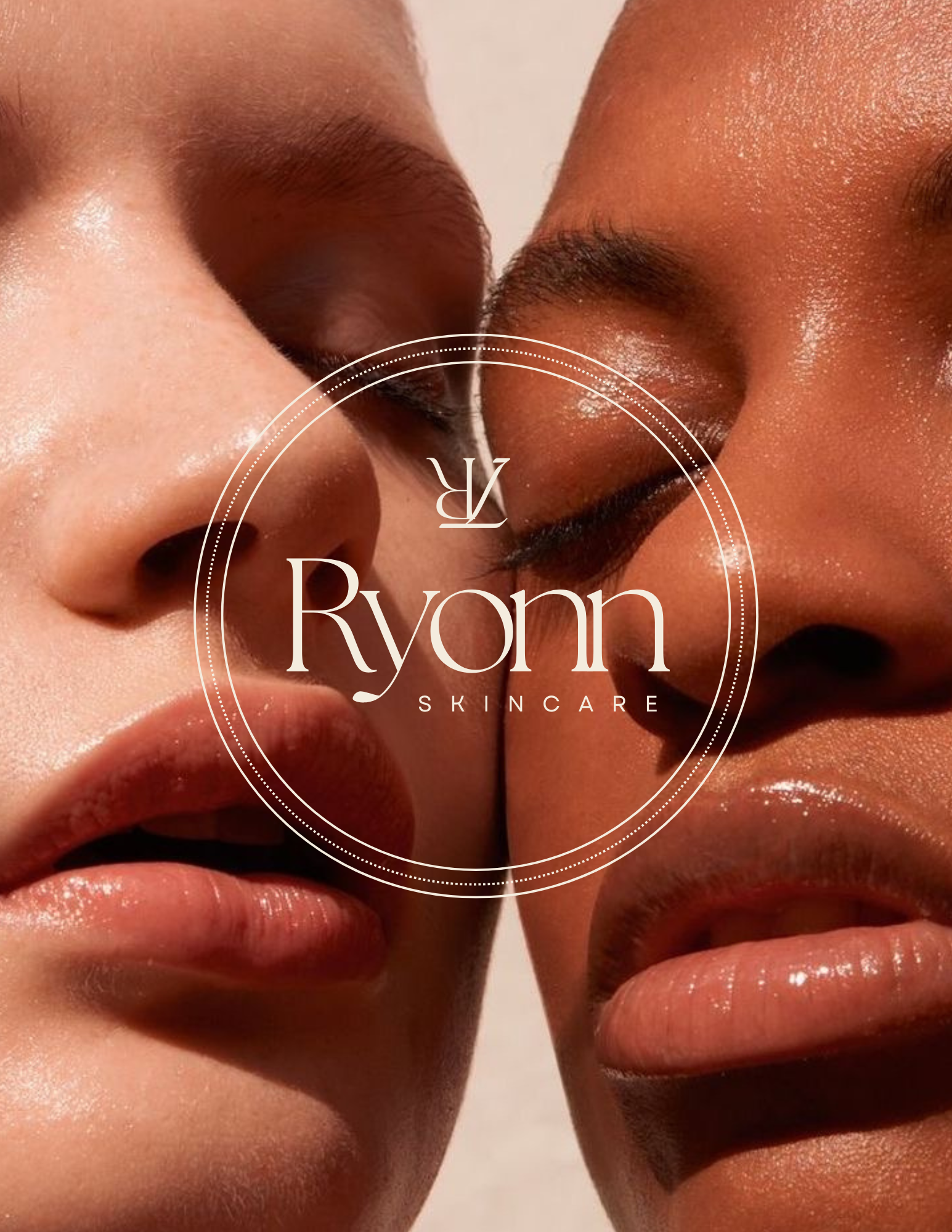
// THE RYONN PROJECT

This custom brand identity and website design project was a full rebrand for a growing beauty business offering makeup, skincare products, and travel-based services. We transformed their outdated brand into a feminine, modern, and elevated aesthetic that aligns with their expansion and ideal clientele. Every detail was strategically designed to enhance their online presence, support product sales and bookings, and create a seamless, conversion-focused experience.
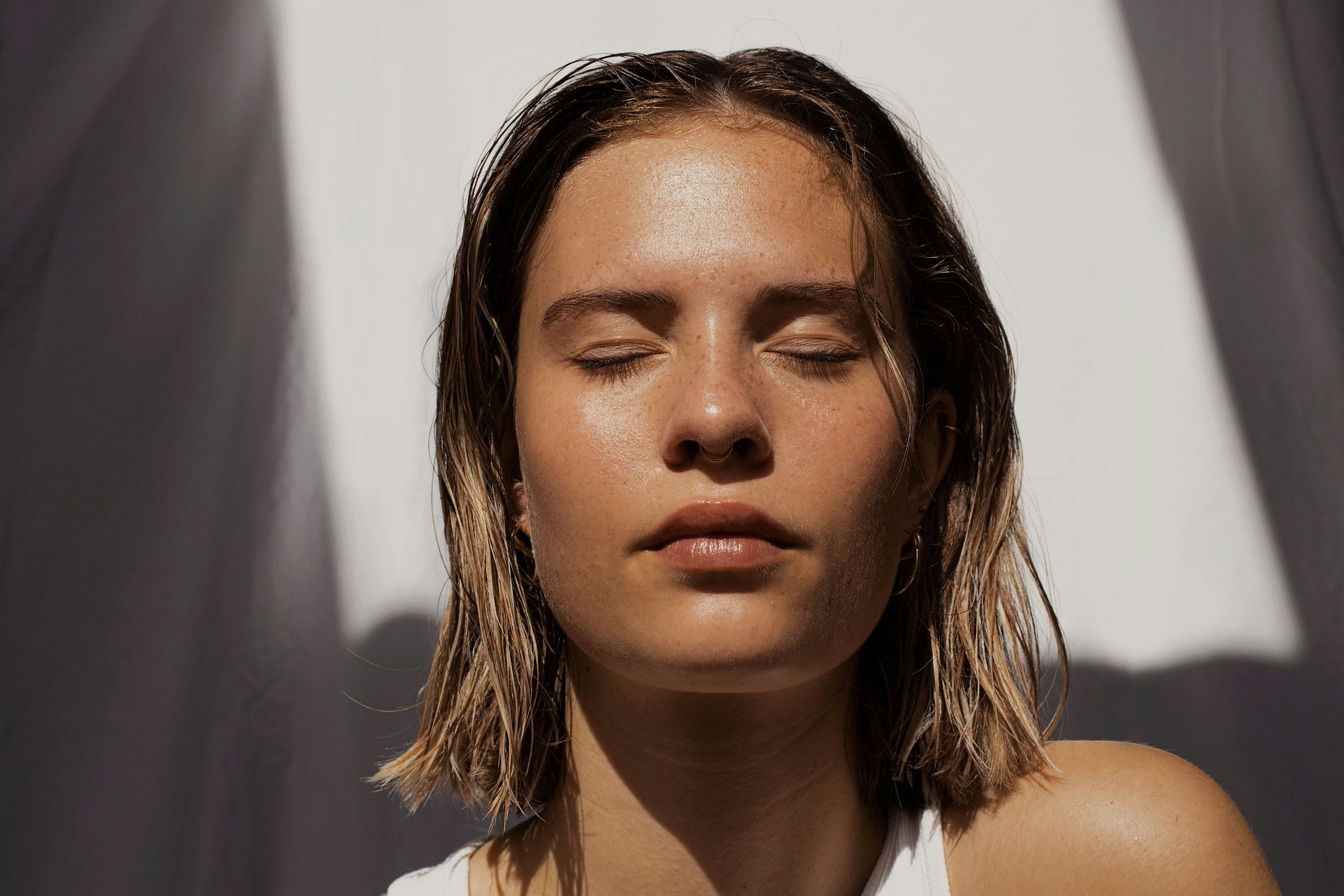
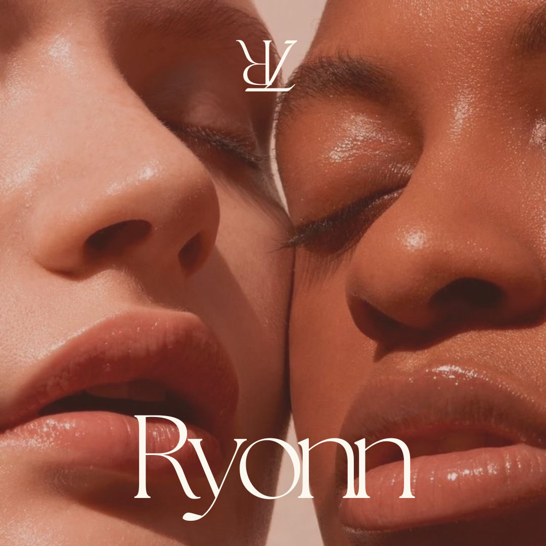
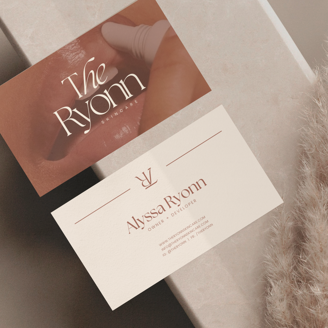
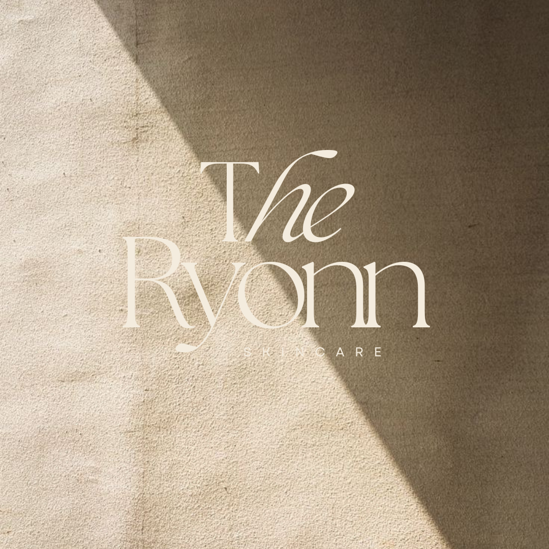
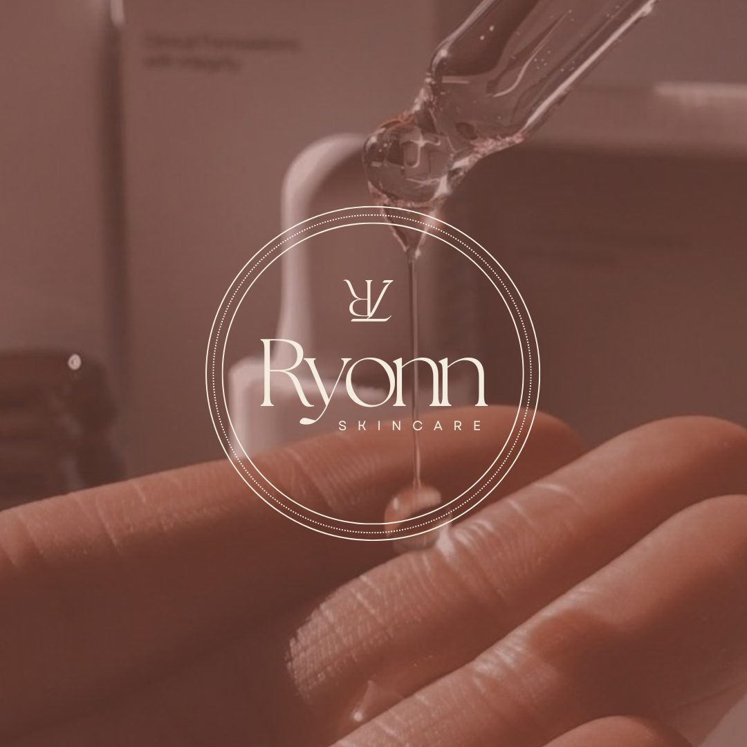
Custom Brand Identity for Luxury Skincare Group, The Ryonn
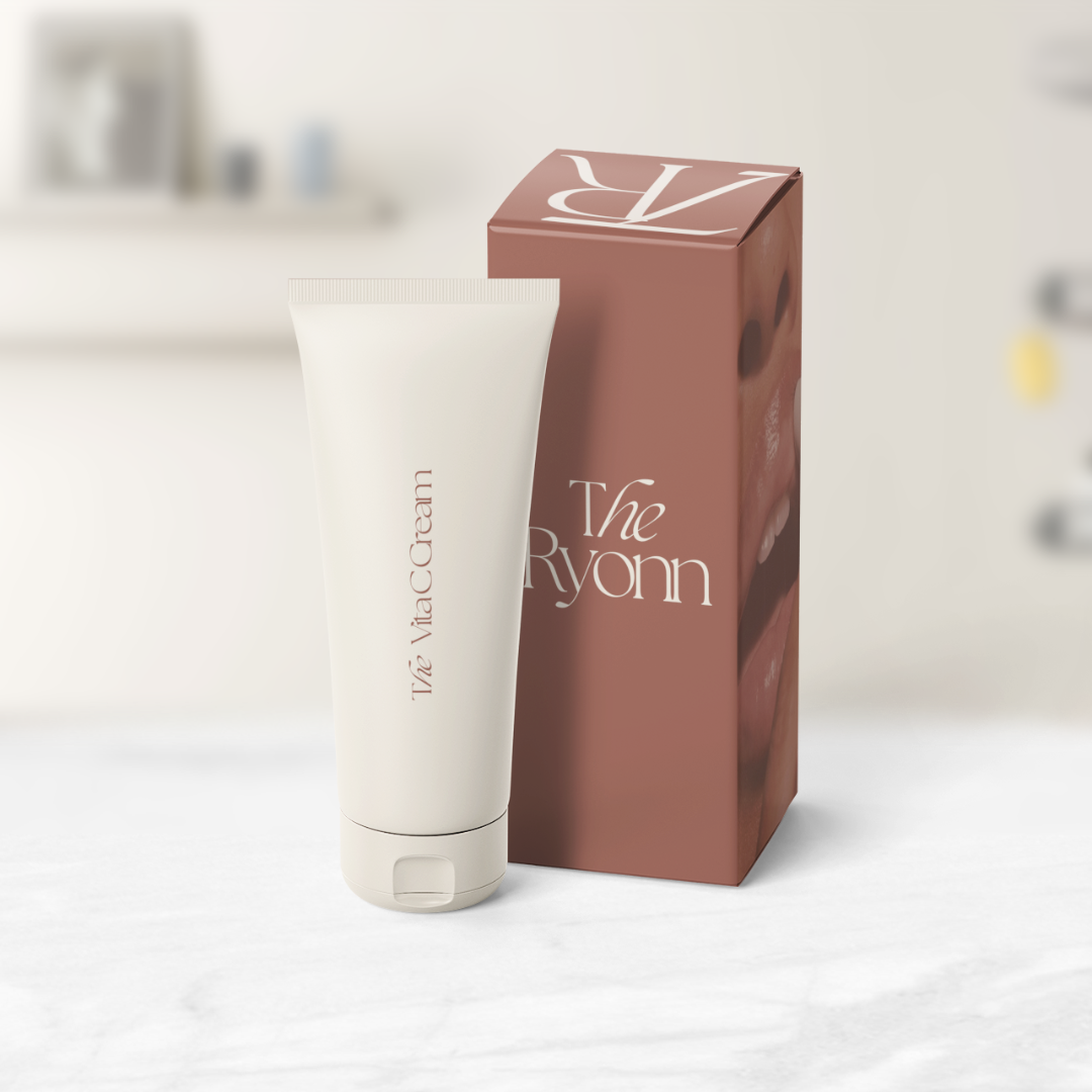
DRIPS ON THE GLOW
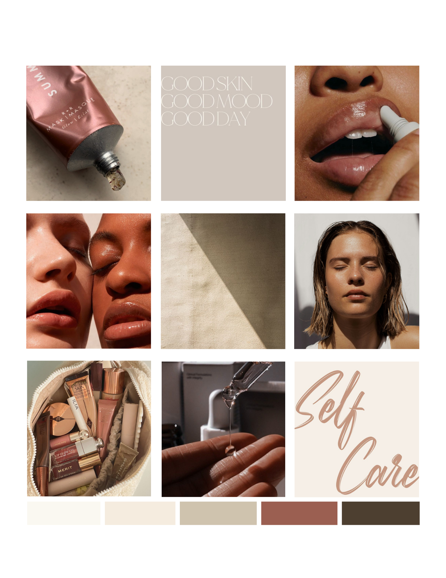

What they received
// TESTIMONIAL
“We loved working with Justine!
Our logo was designed in a rush years ago and we desperately needed an upgrade. And Justine delivered! She is very detail-oriented and knows what she’s doing. Our brand turned out so gorgeous and better than we expected.”
// YOU MAY ALSO LIKE


Position Your Business as the Premium Choice?
ARE YOU READY TO
Schedule your Deep Dive and let’s uncover what’s standing between you and higher-value bookings.